Joraisip
Joraisip
Joraisip
Joraisip
Industry
Industry
Industry
Food and Beverage
Food and Beverage
Food and Beverage
Skills
Skills
Skills
Branding
Branding
Branding
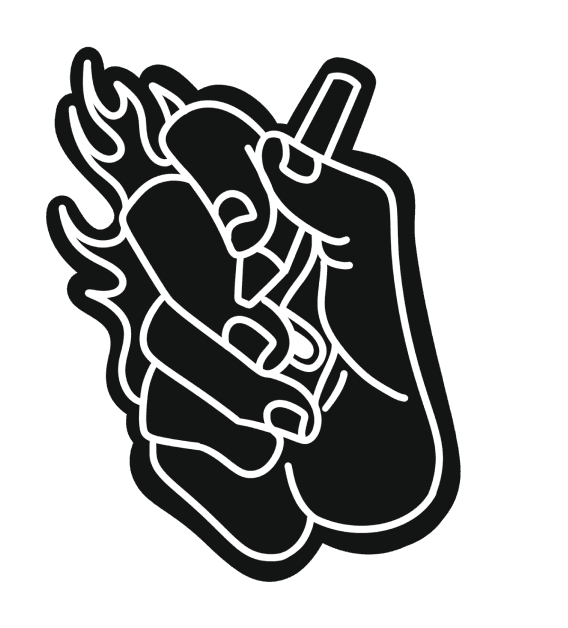
Illustration
Illustration
Illustration
Tools
Tools
Tools
Illustrator
Illustrator
Illustrator
Timeline
Timeline
Timeline
May 2024- June 2024
May 2024- June 2024
May 2024- June 2024
Skip to Reflections
Skip to Reflections
Skip to Reflections
Skip to Reflections
All about Joraisip
All about Joraisip
All about Joraisip
Background information
Background information
Background information
Background information
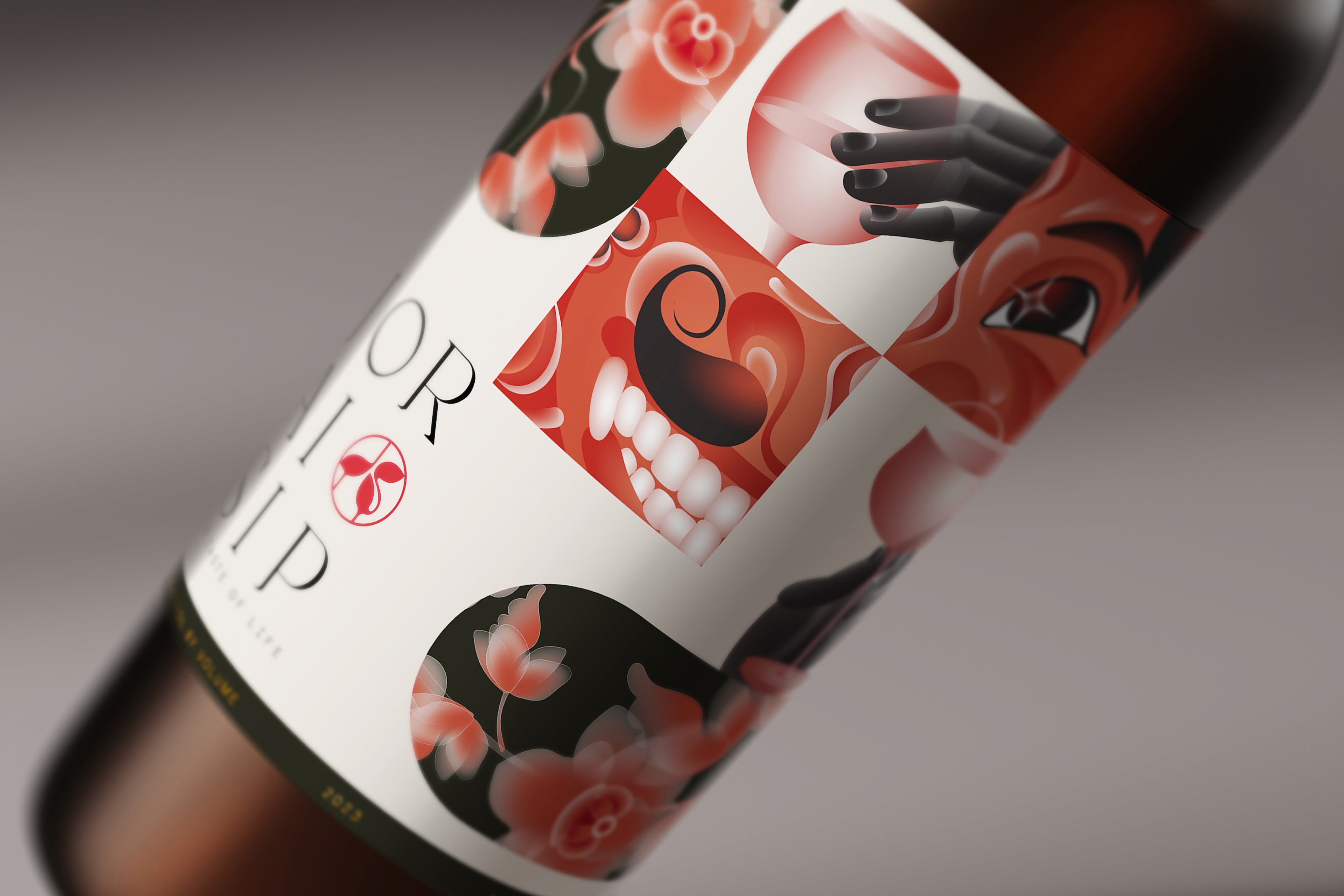
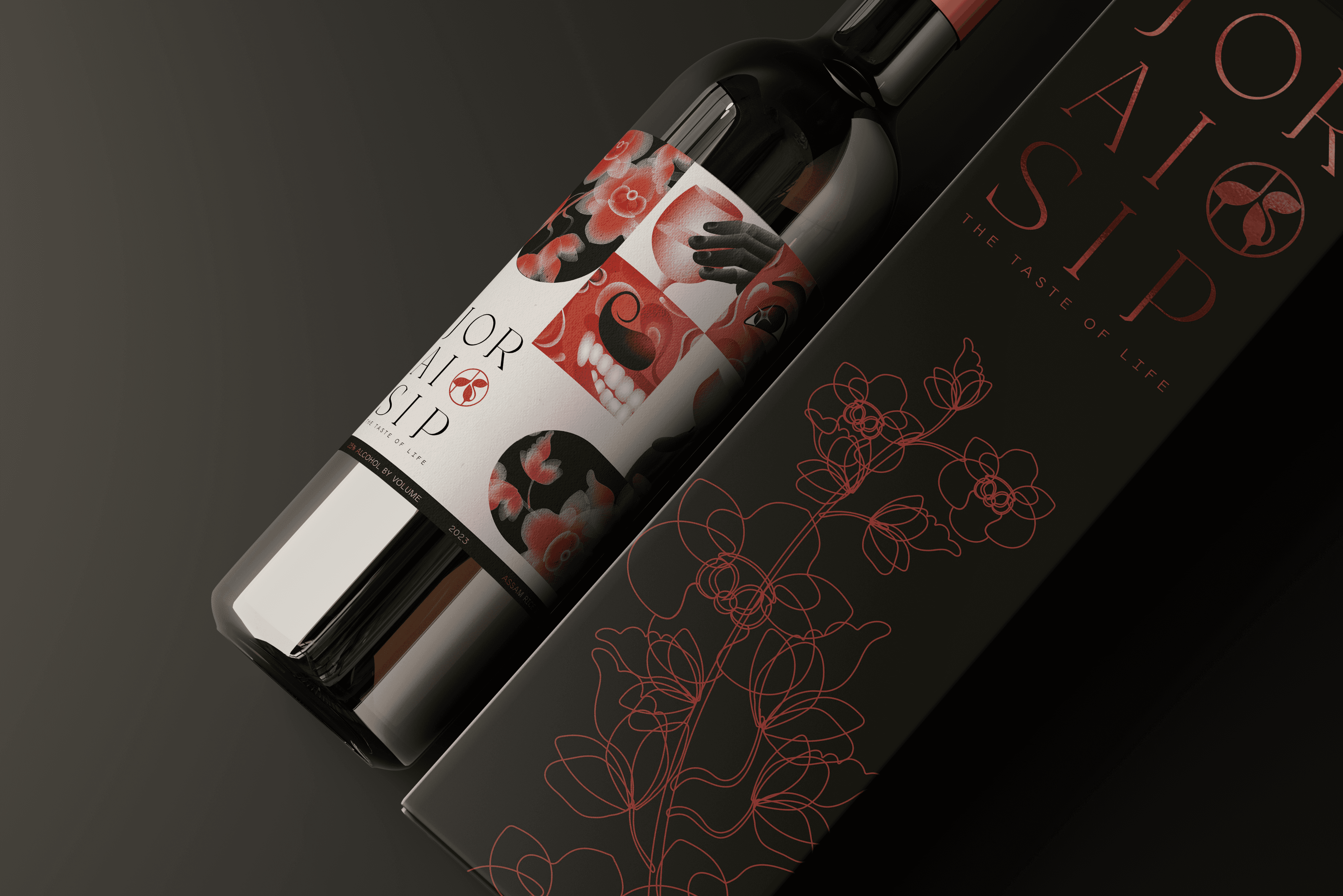
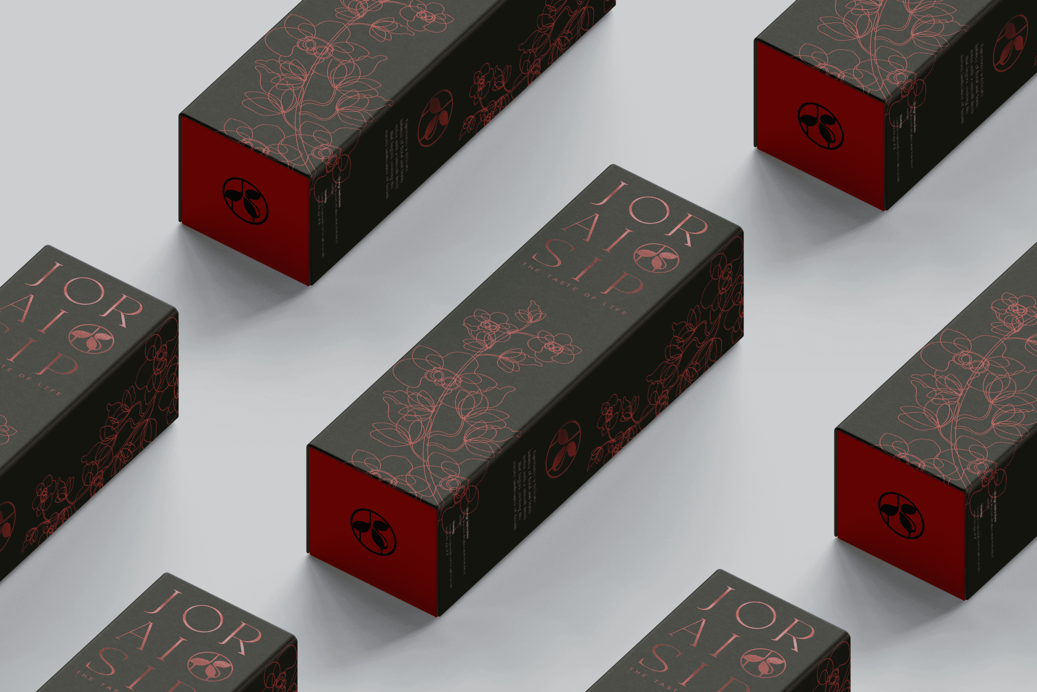
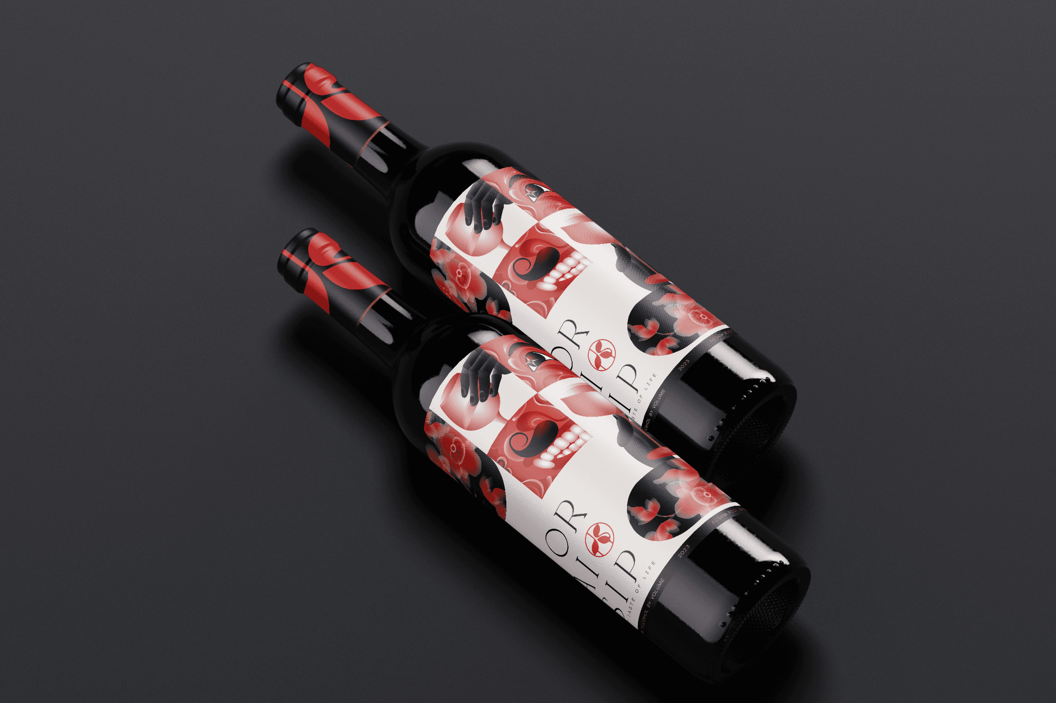
joraisip is an East Indian rice wine brand based in the state of Assam, inspired from the traditional rice wine called Judima of the Assamese Dimasa tribe, perfect for all occasions be it a festival or something as simple as unwinding and relaxing.
joraisip is an East Indian rice wine brand based in the state of Assam, inspired from the traditional rice wine called Judima of the Assamese Dimasa tribe, perfect for all occasions be it a festival or something as simple as unwinding and relaxing.
joraisip is an East Indian rice wine brand based in the state of Assam, inspired from the traditional rice wine called Judima of the Assamese Dimasa tribe, perfect for all occasions be it a festival or something as simple as unwinding and relaxing.
Vision
Vision
Vision
Vision
My design process usually always starts by gathering visual artifacts that embody the spirit of the product. For Joraisip, being part Assamese myself, I knew I wanted to pay tribute to the culture of Assam and the act of drinking as a means to celebrate.
My design process usually always starts by gathering visual artifacts that embody the spirit of the product. For Joraisip, being part Assamese myself, I knew I wanted to pay tribute to the culture of Assam and the act of drinking as a means to celebrate.
My design process usually always starts by gathering visual artifacts that embody the spirit of the product. For Joraisip, being part Assamese myself, I knew I wanted to pay tribute to the culture of Assam and the act of drinking as a means to celebrate.
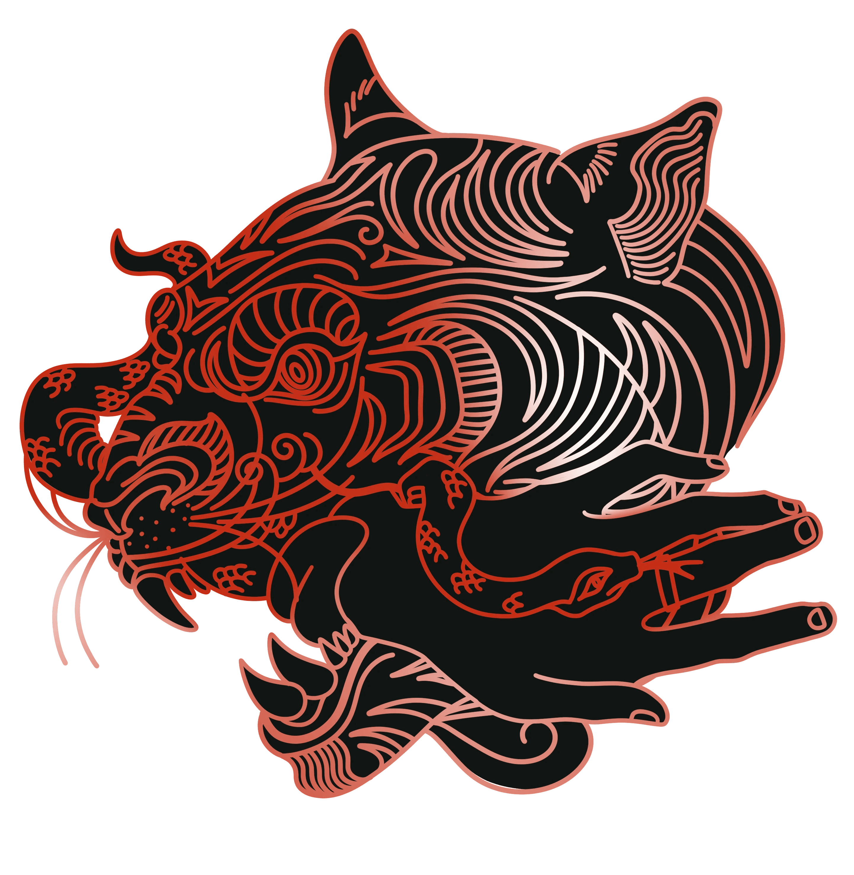
Bold illustrations in the color palette of red, white and black.
Bold illustrations in the color palette of red, white and black.
Bold illustrations in the color palette of red, white and black.
Using cultural elements like the performing art using Majuli masks, the textiles and the state flower
Using cultural elements like the performing art using Majuli masks, the textiles and the state flower
Using cultural elements like the performing art using Majuli masks, the textiles and the state flower
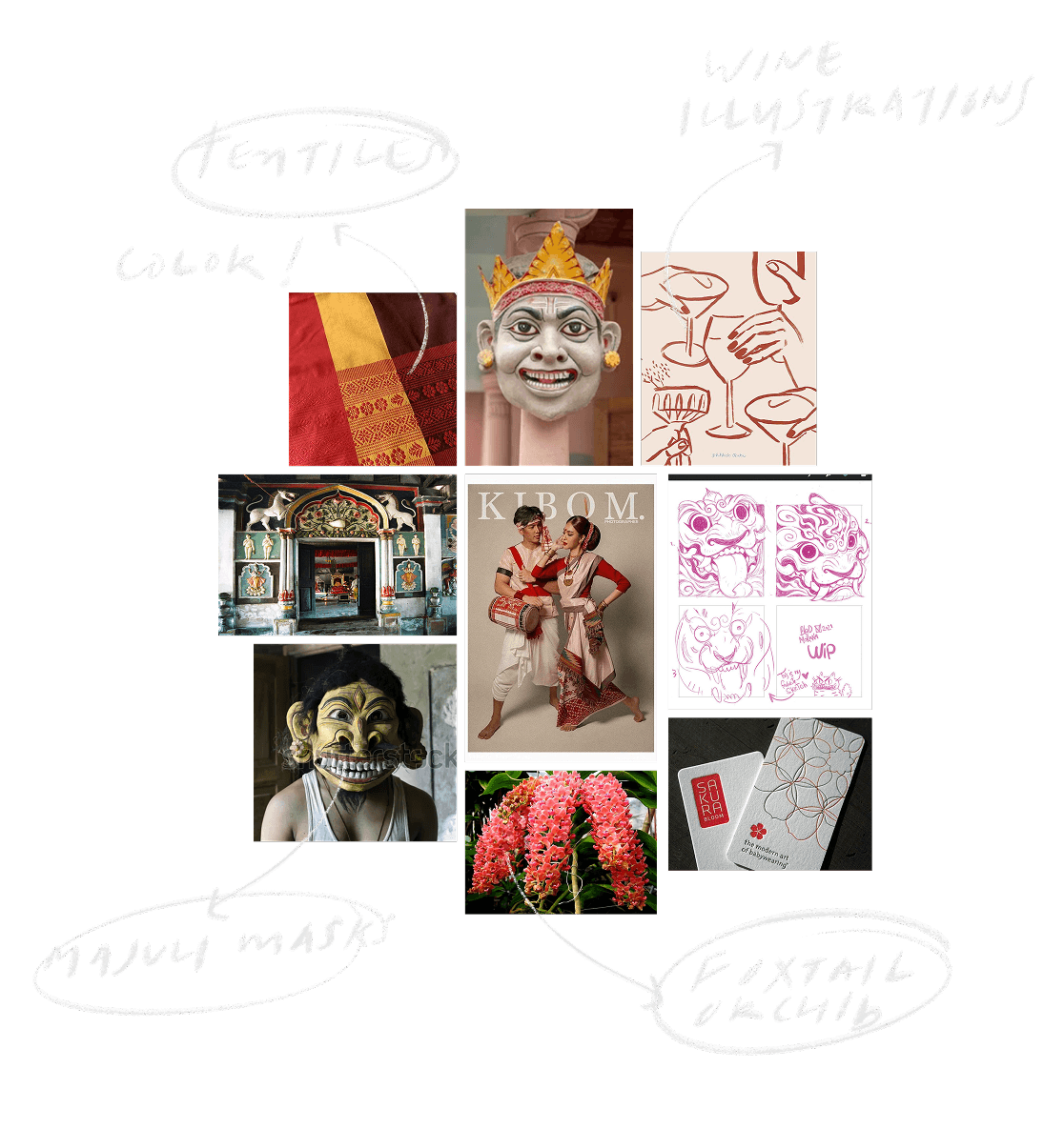
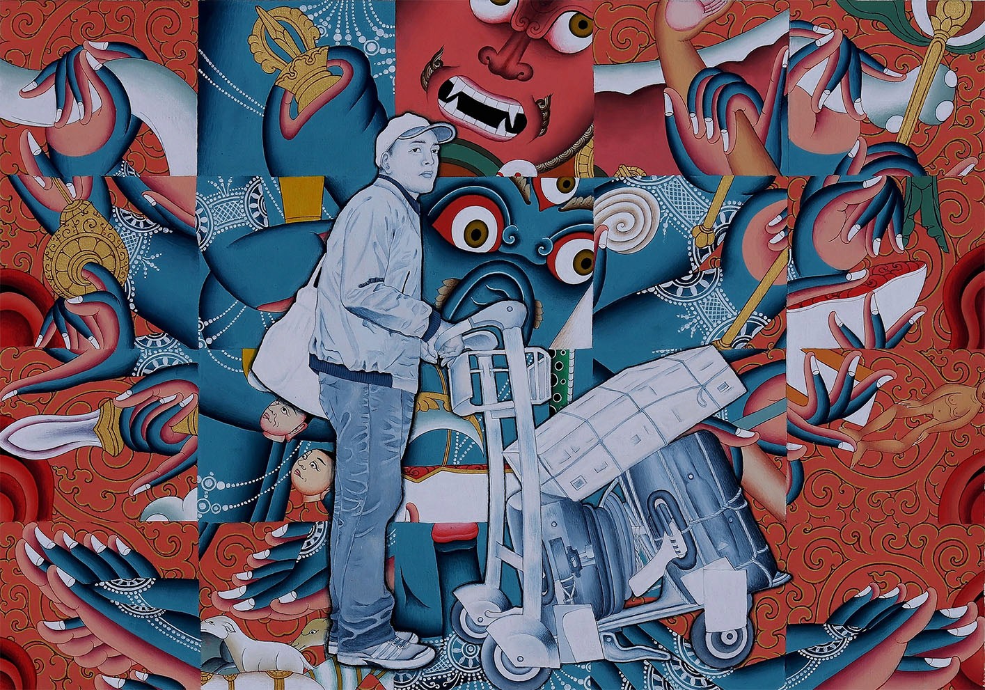
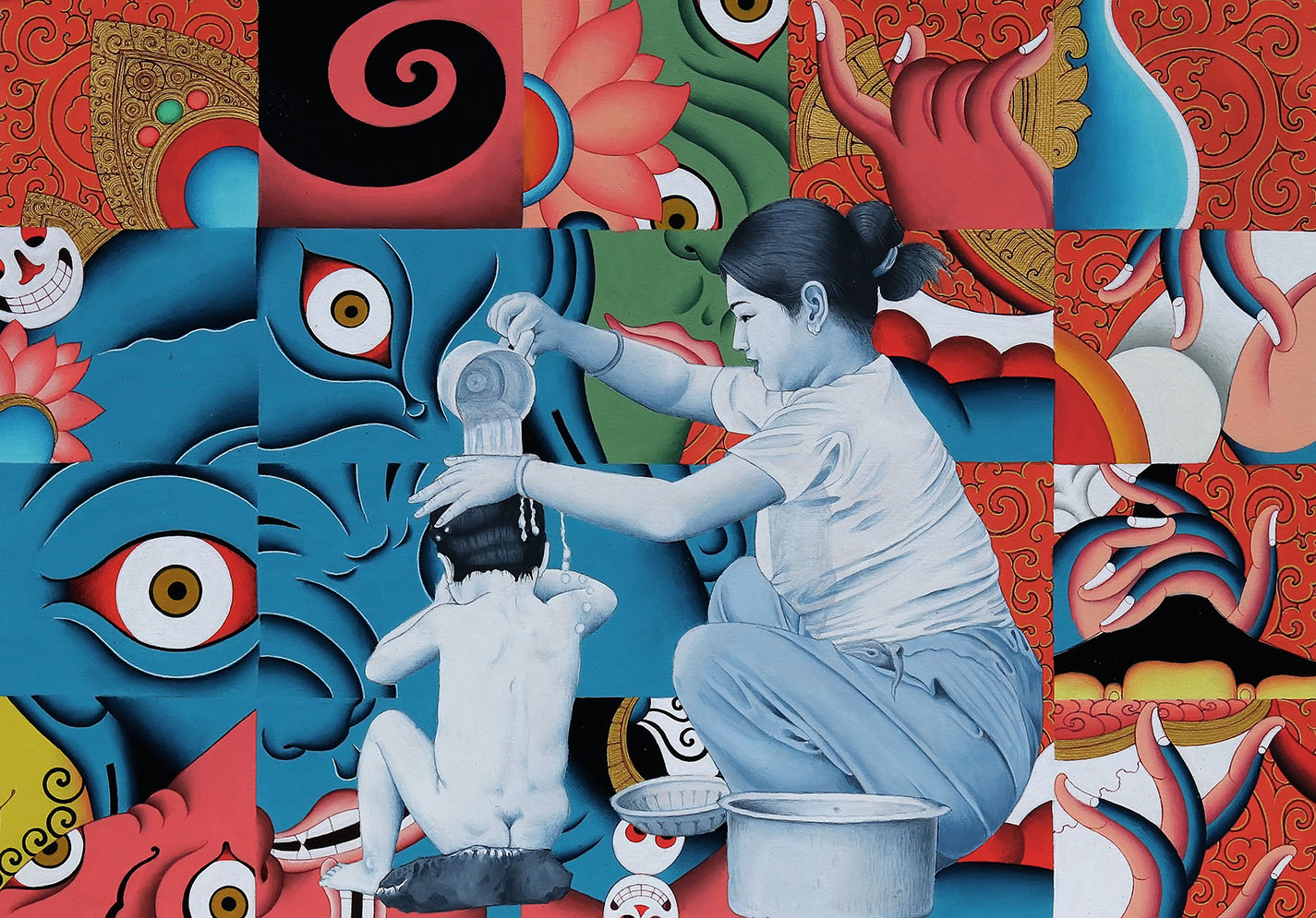
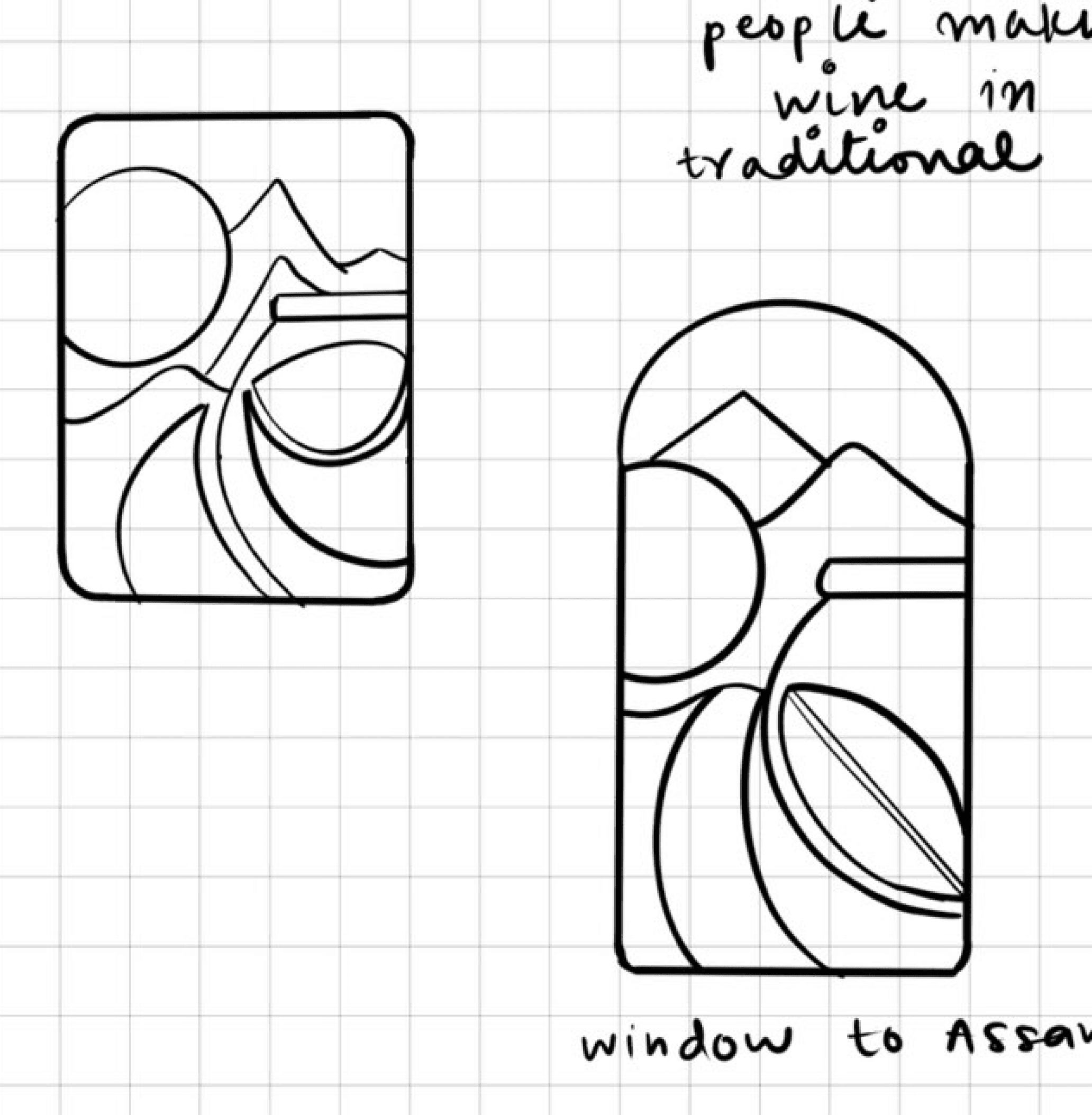
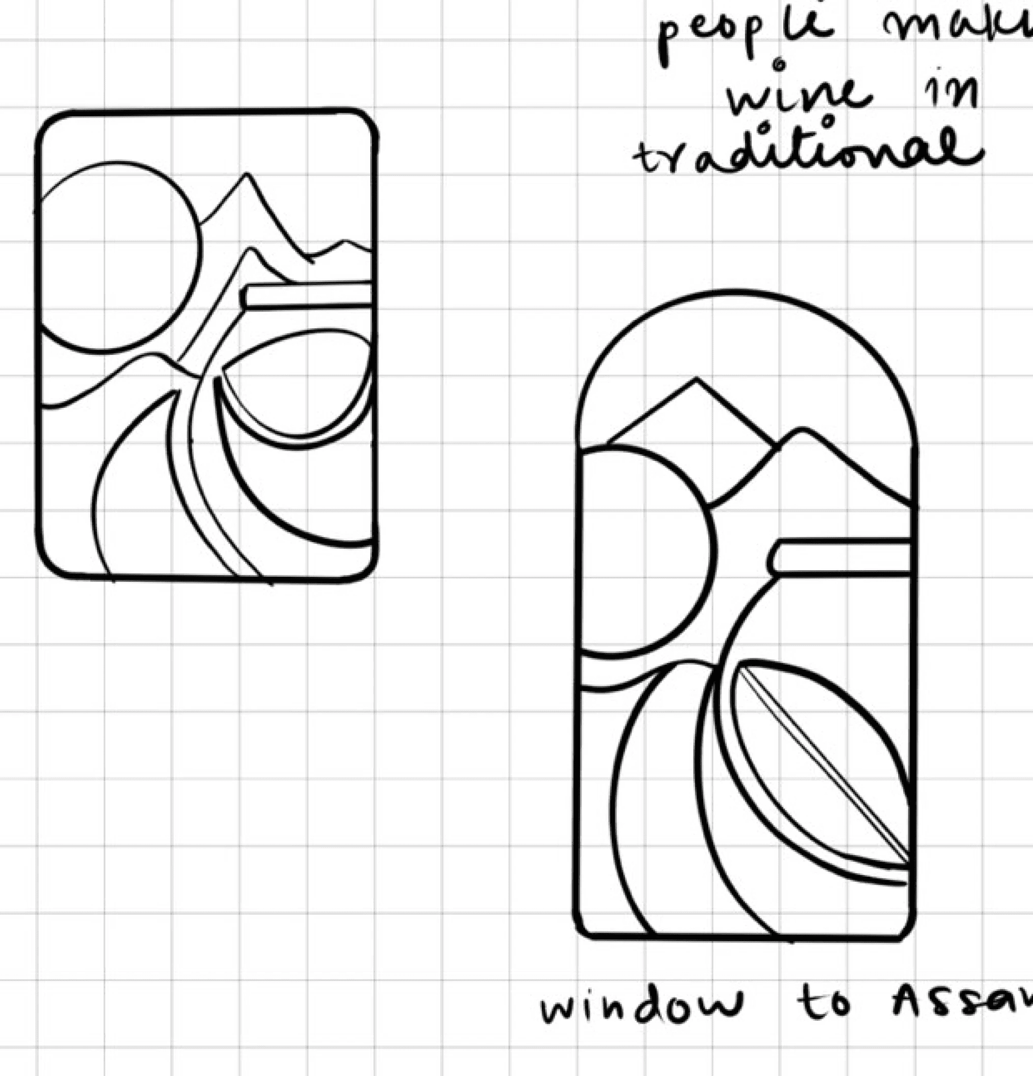
Having a fascination with art since childhood, I like using art as a source of inspiration in my works, for the structuring and layout of the illustrations in small squares for Joraisip, I was influenced by the miniature works of Tsherin Sherpa.
Having a fascination with art since childhood, I like using art as a source of inspiration in my works, for the structuring and layout of the illustrations in small squares for Joraisip, I was influenced by the miniature works of Tsherin Sherpa.
Having a fascination with art since childhood, I like using art as a source of inspiration in my works, for the structuring and layout of the illustrations in small squares for Joraisip, I was influenced by the miniature works of Tsherin Sherpa.
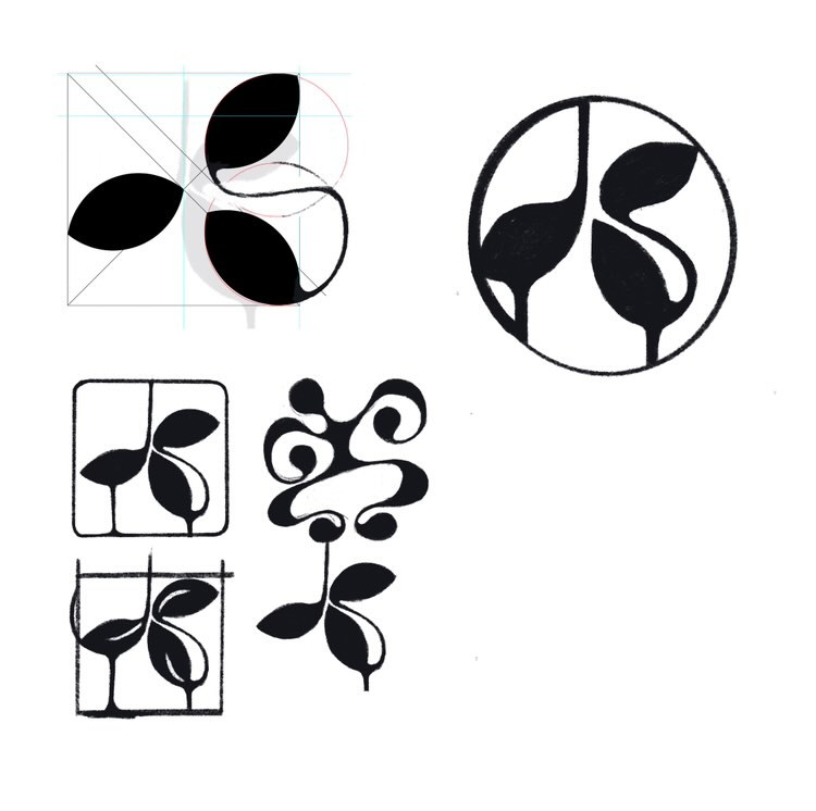
Logo explorations
Logo explorations
Logo explorations
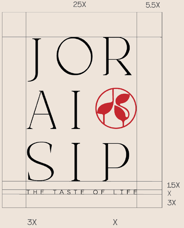
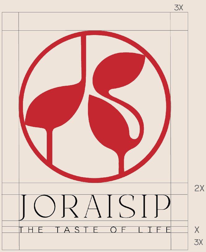
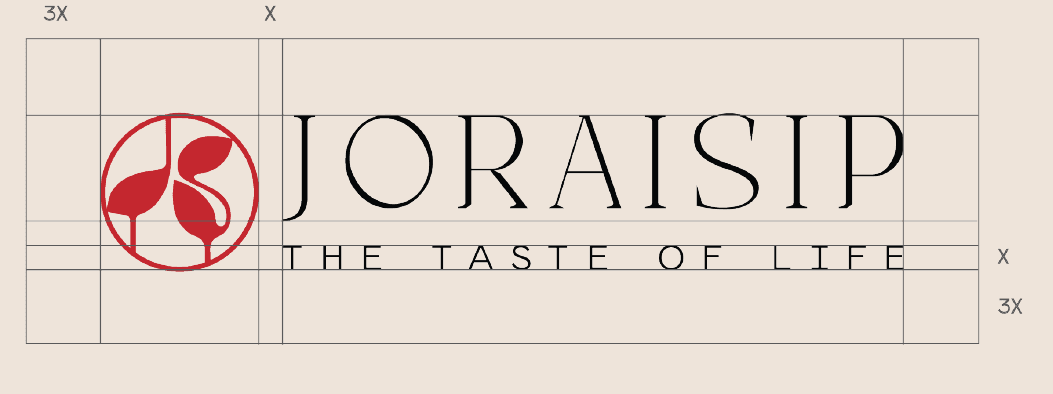
The logo uses a leaf shape to create a cluster of leaves as a tribute to the world famous Assam tea, the leaf shape is carefully manipulated to resemble wine glasses to create the character ‘J’ and ‘S’ for the word Joraisip.
The logo uses a leaf shape to create a cluster of leaves as a tribute to the world famous Assam tea, the leaf shape is carefully manipulated to resemble wine glasses to create the character ‘J’ and ‘S’ for the word Joraisip.
The logo uses a leaf shape to create a cluster of leaves as a tribute to the world famous Assam tea, the leaf shape is carefully manipulated to resemble wine glasses to create the character ‘J’ and ‘S’ for the word Joraisip.
Logo iterations
Logo iterations
Logo iterations
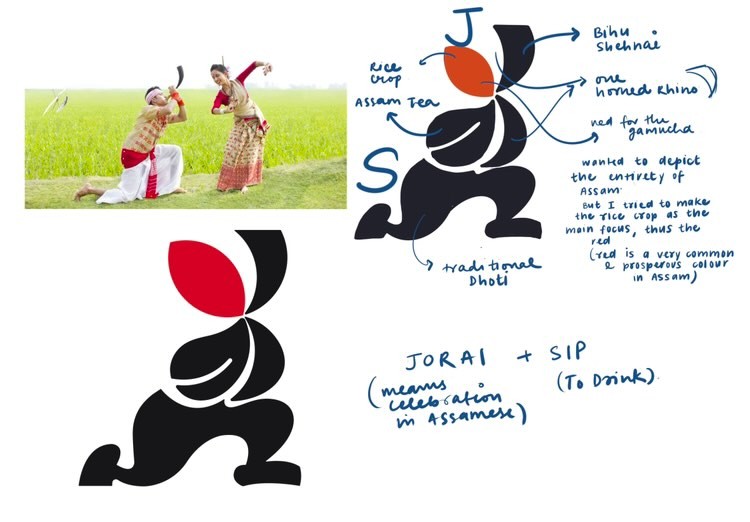
I realized through the logo making process that while incorporating the cultural symbols belonging to the state, I was trying to fit in everything I could possibly think of and tried to make it as abstract as possible, this led to increased complexity in design and made me lose the context which was a rice wine brand in this creative confusion, which didn’t work out. In the final logo I tried to limit myself in representation and made myself stick to the target.
I realized through the logo making process that while incorporating the cultural symbols belonging to the state, I was trying to fit in everything I could possibly think of and tried to make it as abstract as possible, this led to increased complexity in design and made me lose the context which was a rice wine brand in this creative confusion, which didn’t work out. In the final logo I tried to limit myself in representation and made myself stick to the target.
I realized through the logo making process that while incorporating the cultural symbols belonging to the state, I was trying to fit in everything I could possibly think of and tried to make it as abstract as possible, this led to increased complexity in design and made me lose the context which was a rice wine brand in this creative confusion, which didn’t work out. In the final logo I tried to limit myself in representation and made myself stick to the target.
Reflections
Reflections
Reflections
This was my first branding project and looking back, this was the project where i learnt how much I love to incorporate culture and vernaculars, either as easter eggs or in a very obvious way, I am usually used to creating illustration using procreate but this time I restricted myself to illustrator in order to get high quality vectors.
This was my first branding project and looking back, this was the project where i learnt how much I love to incorporate culture and vernaculars, either as easter eggs or in a very obvious way, I am usually used to creating illustration using procreate but this time I restricted myself to illustrator in order to get high quality vectors.
This was my first branding project and looking back, this was the project where i learnt how much I love to incorporate culture and vernaculars, either as easter eggs or in a very obvious way, I am usually used to creating illustration using procreate but this time I restricted myself to illustrator in order to get high quality vectors.
let’s make something good.
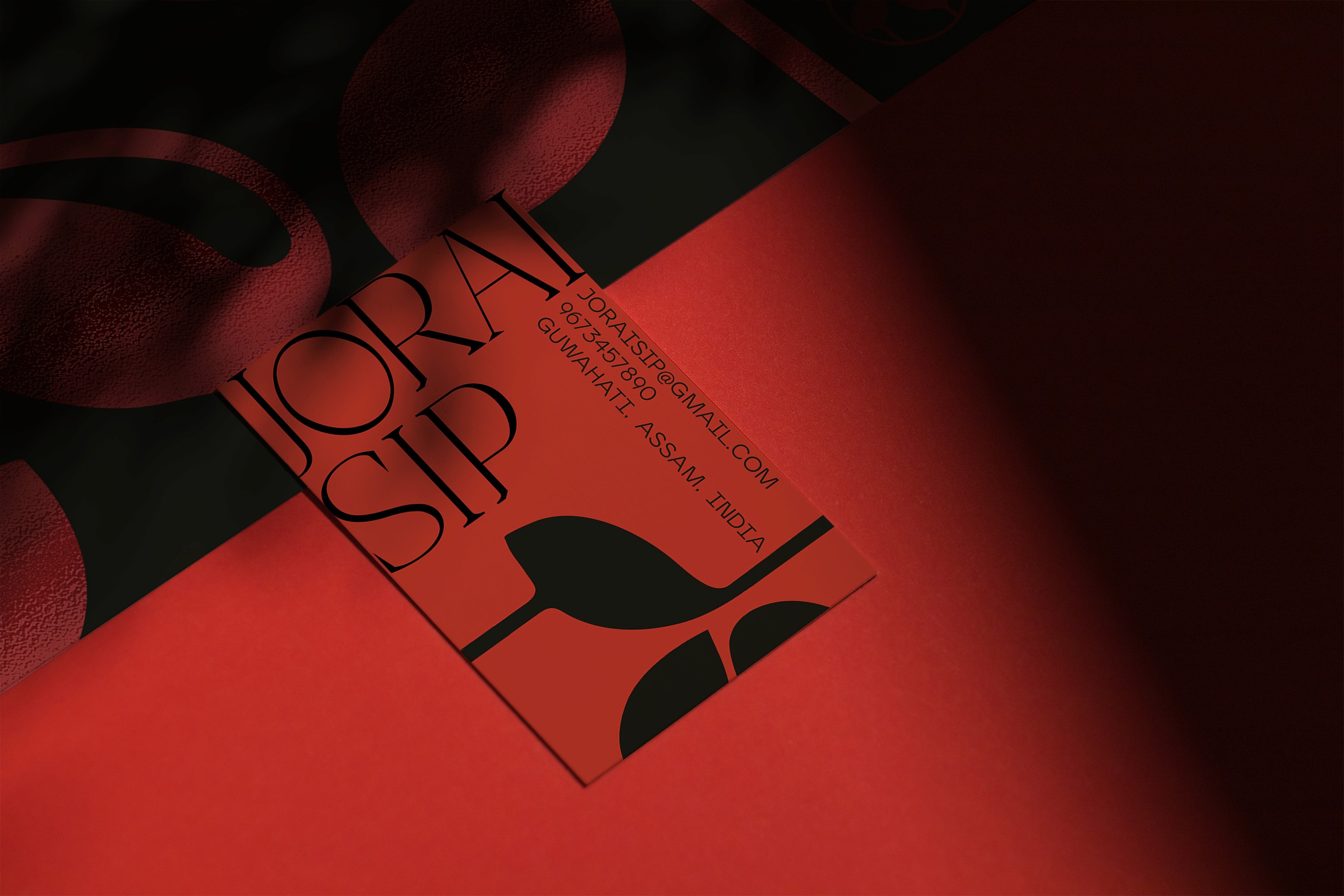
VANSHIKA SINGH
DELHI, INDIA
an architecture undergraduate from IIT Roorkee, who loves anything that has to do with design, the ability to create your own language of expression through your craft is what drives me and my process
let’s make something good.